Responsive SwiftUI
When building in SwiftUI, it’s important to let your layout respond naturally to the content. Dynamic content sizing should drive layout changes — for example, items might be displayed in a grid when there’s plenty of space, but switch to a list view when the content grows or the available space shrinks.
Supporting landscape orientation is equally important. Your layout should adapt fluidly, without breaking the user experience. SwiftUI makes all of this easier by encouraging declarative layout and responsiveness from the start.
Finally, make sure navigation behaves consistently across all views and orientations.
Overall, this leads to a more complex design that is easier to get right up front, rather than trying to retrofit later. SwiftUI Previews can be used to check all style variations, at both screen and component level.
This is a common concept in web development based on CSS breakpoints and media queries. Typically used to handle the difference in desktop, tablet and mobile display.
Screens
Ensure your screens adapt their view style based on Dynamic Type sizes.
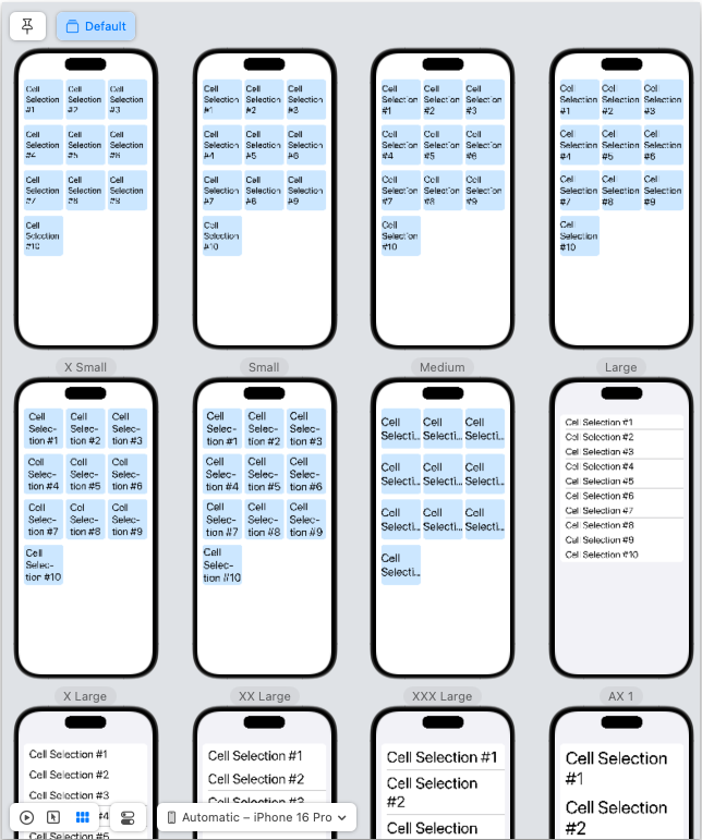
This example of switching from grid to list is triggered when the Dynamic Type size is increased to ‘AX 1’ (the first accessibility size).
struct AdaptiveLayoutView: View {
    @Environment(\.dynamicTypeSize) var dynamicTypeSize

    var isLargeText: Bool {
        dynamicTypeSize >= .accessibility1
    }

    var columns: [GridItem] {
        Array(repeating: GridItem(.flexible()), count: dynamicTypeSize >= .accessibility1 ? 1 : 3)
    }

    var body: some View {
        let items = (1...10).map { "Cell Selection #\($0)" }

        Group {
            if isLargeText {
                List(items, id: \.self) { Text($0) }
            } else {
                ScrollView {
                    LazyVGrid(
                        columns: columns,
                        spacing: 16
                    ) {
                        ForEach(items, id: \.self) {
                            Text($0)
                                .frame(
                                    width: 120,
                                    height: 120,
                                    alignment: .center
                                )
                                .font(.title)
                                .background(Color.blue.opacity(0.2))
                                .cornerRadius(10)
                        }
                    }
                    .padding()
                }
            }
        }
    }
}
Note: this example handles screen layout but does not handle component layout.
You will find documentation with two different syntaxes for Dynamic Type sizes e.g.
.accessibility1and.accessibilityMediumIf you are developing with SwiftUI and targeting iOS 15 or later, you should use the
.accessibility1syntax. For UIKit, you should use the.accessibilityMediumsyntax.
We can check the layout is reacting correctly with a single SwiftUI Preview.
#Preview("Default") {
    AdaptiveLayoutView()
}
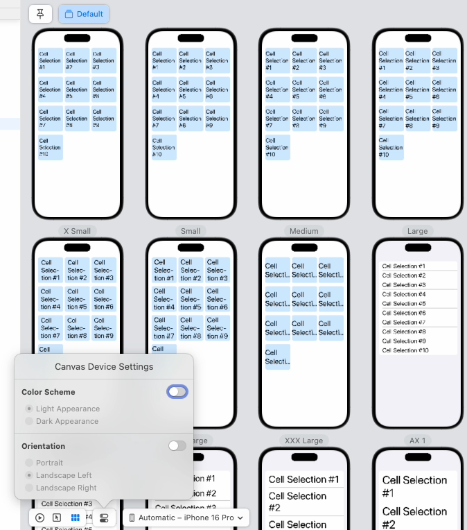
This will show the layout view with default settings. We can adjust this using the Variants options and Canvas Device Settings. These each have options for Color Scheme, Orientation and Dynamic Type size.
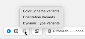
Selecting Dynamic Type variants, provides 12 previews for accessibility sizes. This provides a much quicker overview than manual testing. This is possible without having to set up multiple SwiftUI previews.
Select Canvas Device Settings, to change orientation and color scheme.
Selecting Orientation and a Landscape option, updates the preview.
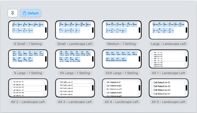
This demonstrates that the view layout is behaving correctly. However, it does show that the content is not always displayed correctly. Each component needs to be considerate of layout too.
Components
The above principles for screens can also be applied to components.
A component’s design should scale to the style of the layout.
Sample data structure to be shown in the view.
struct CityWeather: Identifiable {
    let id = UUID()
    let city: String
    let temperature: String
    let iconName: String // SF Symbol for weather
}
Sample data to be shown.
CityWeather(city: "London", temperature: "18°C", iconName: "cloud.drizzle.fill")This simple layout example changes to show the weather icon and temperature alongside each other when the view is in larger accessibility sizes. The same layout trigger when the main view changes from a grid to a list.
    struct InnerStack: View {
        @Environment(\.dynamicTypeSize) var dynamicTypeSize
        var cityWeather: CityWeather

        var isLargeText: Bool {
            dynamicTypeSize >= .accessibility1
        }

        var body: some View {
            Group {
                if isLargeText {
                    VStack(alignment: .center, spacing: 8) {
                        cityText
                        HStack {
                            weatherIcon
                            temperatureText
                        }
                    }.padding()
                } else {
                    VStack(spacing: 8) {
                        cityText
                        weatherIcon
                        temperatureText
                    }
                    .frame(width: 160, height: 160)
                }
            }
        }
    }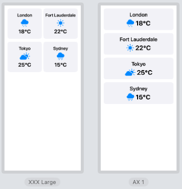
By swapping out the Text component for the InnerStack component, both screen and component layouts are updated.
Updated AdaptiveLayoutView with component view
struct AdaptiveLayoutView: View {

    let weatherData = [
        CityWeather(city: "London", temperature: "18°C", iconName: "cloud.drizzle.fill"),
        CityWeather(city: "Fort Lauderdale", temperature: "22°C", iconName: "sun.max.fill"),
        CityWeather(city: "Tokyo", temperature: "25°C", iconName: "cloud.sun.fill"),
        CityWeather(city: "Sydney", temperature: "15°C", iconName: "cloud.rain.fill")
    ]

    @Environment(\.dynamicTypeSize) var dynamicTypeSize

    var isLargeText: Bool {
        dynamicTypeSize >= .accessibility1
    }

    var columns: [GridItem] {
        Array(repeating: GridItem(.flexible()), count: dynamicTypeSize >= .accessibility1 ? 1 : 2)
    }

    var body: some View {
        Group {
            if isLargeText {
                List(weatherData, id: \.self) { item in
                    InnerStack(cityWeather: item)
                }
            } else {
                ScrollView {
                    LazyVGrid(
                        columns: columns,
                        spacing: 16
                    ) {
                        ForEach(weatherData, id: \.self) { item in
                            ZStack {
                                RoundedRectangle(cornerRadius: 12)
                                    .fill(Color(.systemGray6))
                                VStack {
                                    InnerStack(cityWeather: item)
                                }
                            }
                        }
                    }
                    .padding()
                }
            }
        }

        private var cityText: some View {
        Text(cityWeather.city)
            .font(.headline)
            .multilineTextAlignment(.leading)
            .lineLimit(1)
            .truncationMode(.tail)
            .minimumScaleFactor(isLargeText ? 1.0 : 0.5)
        }

        private var weatherIcon: some View {
            Image(systemName: cityWeather.iconName)
                .resizable()
                .scaledToFit()
                .foregroundColor(.blue)
                .frame(height: 40)
        }

        private var temperatureText: some View {
            Text(cityWeather.temperature)
                .font(.title2)
                .bold()
        }
    }
}
Hierarchy
Checking the view hierarchy with Accessibility Inspector, each grid cell is not navigated together. Each element is navigated separately, in horizontal then vertical order.
cloud.drizzle.fillreads out as Drizzle,cloud.rain.fillas Rain andcloud.sun.fillas Partly Cloudy. But it readssun.max.fillas Brightness Higher.When using
.accessibilityElement(children: .combine)the text is not read out although the other text fields are.Another example of getting away with something until accessibility nudges you towards best practices.
Refactored the weather icon to provide a description
enum WeatherIcon: String {
    case sun = "sun.max.fill"
    case rain = "cloud.rain.fill"
    case cloud = "cloud.fill"
    case drizzle = "cloud.drizzle.fill"

    var description: String {
        [
            .sun: "Sunny",
            .rain: "Rain",
            .cloud: "Cloudy",
            .drizzle: "Drizzle"
        ][self] ?? ""
    }
}
Updated weather icon to add an accessibility label.
    private var weatherIcon: some View {
        Image(systemName: cityWeather.iconName.rawValue)
            .resizable()
            .scaledToFit()
            .foregroundColor(.blue)
            .frame(height: 40)
            .accessibilityLabel(cityWeather.iconName.description)
    }
Added accessibility element combine to the component view.
struct InnerStack: View {
    ...
    var body: some View {
        Group {
        }.accessibilityElement(children: .combine)
    }
    ...
}
Each grid element is navigated correctly.
Because the changes have been made at the component level, they also work at higher accessibility sizes when shown as a list.
Testing
There are multiple ways to test the multiple combinations of layout and accessibility settings.
SwiftUI Previews
Within the SwiftUI preview canvas, you can select Dynamic Type Variants for your preview. This will show all variations of all Dynamic Types, from ‘X Small’ to ‘AX 5’.
Simulator and Device
Dynamic type size can be set on the simulator or device via the Settings menu:
Settings > Accessibility > Display & Text Size > Larger Text
Accessibility Inspector
Accessibility Inspector is installed with Xcode. From the Xcode menu, select Open Developer Tool > Accessibility Inspector.
Select Simulator > All processes.
For hierarchy testing, select Inspection from the toolbar.
- Use target button to select an item for inspection
- Use the Speak button to hear the Voice Over description for selected item
- Use the next and previous buttons to navigate your app
- Use the play button to auto-navigate through your app
For Dynamic type testing:
Accessibility Inspector > Settings toolbar > Dynamic Type Use the slider to see updates in your app.
Control Centre
[iOS 18] Swipe down from the top right of your device to display Control Center, select ’+’ from the top left, and select ‘Add a Control’. Search for ‘text’ to find, Display & Brightness Text Size. Select to add and move to an available slot. Accessibility text sizes are now easily available from the Control Centre.
Reference
Dynamic type sizes
There are seven standard Dynamic Type sizes.
- Extra Small
- Small
- Medium
- Large
- Extra Large
- Extra Extra Large
- Extra Extra Extra Large
There are an additional 5 larger accessibility sizes:
- Accessibility Medium
- Accessibility Large
- Accessibility Extra Large
- Accessibility Extra Extra Large
- Accessibility Extra Extra Extra Large
Dynamic type sizes are set on simulator and device from:
Settings > Accessibility > Display & Text Size > Larger Text
Larger accessibility sizes are enabled with a toggle button.
The default type size is medium. Some users use extra small and small settings to increase the information density of their screens. The majority of users increase their font size to something they feel comfortable with.
Don't type, just speak
Write faster in all your apps, on any device, with Wispr Flow.